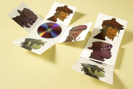
Gorillaz - Demon Days - Punk/Alternative Rock genre
This digi-pack features the four anime characters that depict the artists within the band. The characters are enlarged so that each one fits well on each side of the digi-pack. The rest of the Digi-pack is covered completely in white and so gives a simplistic look to the album. The effect of this may also emphasise the characters that are printed onto the digi-pack because they are in colour and so we instantly glance at them when looking at this digi-pack.
Rihanna - Loud - Pop genre

This digi-pack really emphasises the image of Rihanna and as you can see she is the prime subject of this digi-pack. This could do to with the genre that this album is in which is pop. Because this is a very popular genre and she is very popular then this could infer that this artwork is designed to promote basically that this is a Rihanna album and this is also done by how her face is enlarged to cover the whole digi-pack. Furthermore, it is also very brightly coloured and so catches your eye straight away.
Kanye West - Graduation - hip hop genre
This Digi-pack is a very interesting one which appears to have themes and ideas behind it. For example the bear mascot is being launched from something which infers that it is saying to use your own ideas and dont be afraid to step out of your comfort zone. This idea is also presented within the songs in the album and so the Digi-pack represents the ideas that you can expect within the album. This style of digipack is used often by Hip-hop artists who are trying to promote a certain message to thier target audience.
Metallica - St. anger - Rock Genre
This digipack as soon as you first glance at it contains the colour red which is emphasied alot when its mixed with the white colour. This kind of red can represent the blood and evil which are reouccuring themes within the genre of Rock/HeavyMetal and so if I did a video based on this genre then the digipack would contain this kind of image. The fist also indicates violenece which informs the audience what kind of album this is. The image of the face also take up most of the room which draws your attention away from the albums list of songs which is smaller in comparison.
Mumford and Sons - Sigh no more - Country Genre
As you can immediatly see, this digi pack is very white in colour and gives of a sense of hope. The use of white can indicate the themes of the country genre and that ther is always a brighter side to life. Furthermore, I like how it represnts the band inside the white house which could indicate that they are confined to this postive attitude. The font is very formal and simple which goes very well with the rest of the album.
Nero - Welcome Reality - Electronic/Dubstep genre
This digipack I think is very well done. This is because it almost looks like a poster for a movie becuase of all the titles at the bottom of the front cover are done in a way to look like a movie poster. Furthermore, the artists 'Nero' text is the bigges thing on the album witha very futuristic looking font to it and this could be a way of promoting their name to everyone as this is their debut album. Also, I really like the dark tones used on this digipack as it gives you an idea to how the music sounds within the album and I think the dark blue and black really works well together. On the back the font used is also rather futuristic with all the songs listed vertically.
This digipack clearly has the theme of red as being a big part of hwat is is representing. This colour also goes along with the album name itself 'red' which indicates that this is all connected to what the songs may be about within the album itself. Furthermore, the font of the artist is very large and in a bold font which presents the idea that the designers want the audience to know who the album is by and so then hope that you will buy it because of the artist. R&B tends to have love feelings and dark undertones within the genre and so I think here it is trying to depict these themes in the music by showing the serious face of the artist and how the artist is covered in the red colour further representing the love theme on the alubm. This gives the audience something to expect if they purchase the album and so gives that instant gratification.


No comments:
Post a Comment